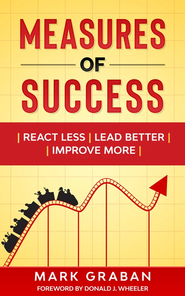
Mark Graban has written a great book on statistics, Measures of Success: React Less, Lead Better, Improve More. He focuses on Process Behavior Charts that help highlight the natural variability of a process and can really show when there has been a change in the underlying system. He does a nice job (for me) of simplifying the concepts and the underlying reasoning. He’s even put the math at the back of the book, in favor of providing clear reasoning and project flow.
I appreciated how he approached the writing and thinking here. I had read Wheeler’s classic Understanding Variation many years ago, but I continued to struggle with a couple of the concepts and didn’t use the knowledge on a regular basis (though I’ve drawn some charts recently). In particular, Graban defined where process behavior charts help an organziation - they help answer three important questions:
1) Are we achieving our target? (and how often)
Are we improving? (and can we predict the future performance - if not, we are out of control)
How do we improve? (and when to react)
Along with these three is another important question that should be clear before even these: what is the goal? What are we trying to achieve? It’s only once we have that that we can ask whether we are reaching the target (near term / long term) and whether we are getting better at doing so.
One of the important concepts that comes out of this book and that I recall from Wheeler is that there are two different things. One is the behavior of the process (thus the name of the chart) - the average and upper/lower control limits demonstrate what the process is capable of doing. This is NOT the same as the desired results, whether those are customer requirements or internal targets. Since these are plotted on graphs, it is easy enough to show the desired result on the chart as well - but it is also very easy to get confused and claim that we “hit the target” one week and “missed the target” the next week when it is simply an effect of normal variation of the process. Or even worse - that the process is not predictable at all, so hitting a target number is more about luck than anything else.
Along with that concept are the key takeaways that Graban develops over the course of the book:
Don’t manage the metric. The metrics are a measure of the work, not the work itself. And the questions above should tell us whether the process is in control and whether it is capable of meeting the desired targets. And if our improvement ideas are making a difference.
Two data points are not a trend. Just because a metric is “better” than last time does not mean the system is improving. This always drives me crazy in news reporting. Almost every day in the newspaper are statistics that make me cringe because they don’t contain enough information to draw the conclusion that is being reported upon.
Data only has meaning when compared over time. See above.
A chart tells a better story than a list of numbers. That’s what the process behavior charts are all about, but even plotting the data over time can show a lot more than a list of numbers (or even worse, green/red boxes without the data).
More than what happened, be able to predict what’s likely to happen. An out-of-control process is unpredictable. This is different from a process that doesn’t always get the results we “want.”
Fluctuations occur for every metric. Variability exists in the world. These charts help to see this in a straightforward way.
Save your breath and time explaining the noise of a metric, since there’s no ‘root cause’. Be thoughtful in your responses, rather than mindlessly reacting to every change.
Measure often. The sooner we see the results, the sooner we can find real signals.
Some additional fun quotes and thoughts:
Several example process behavior chart case studies on Graban’s website.
KPI acronym means “Key Performance Indicators,” not “Ka-jillion Performance Indicators.”
“Process behavior charts have helped me, and other leaders, stop reacting to every up and down [in the numbers].”
Deming: “The worker is not the problem. The system is the problem. If you want to improve performance, you must work on the system.”
“If we retroactively discover a shift [in the process] and we don’t know what changed, there’s a great risk that the system could change back to the way it was.” - If we don’t know what caused a real change in the measurable results, how can we confidently improve the system.
I’ve been enjoying Mark Graban’s Leanblog podcast and blog for some time - his work seems to be mostly centered around Lean and flow with a heavy emphasis on applications in healthcare. And these topics can lead in many directions - such as the understanding of statistics to help understand the processes one is attempting to improve.
